Context
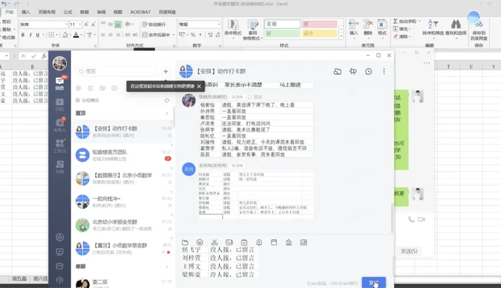
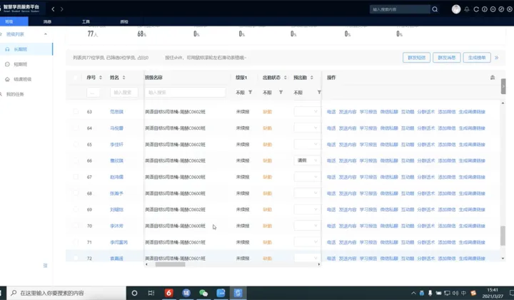
TAL Education Group is a K–12 education company in China. During live classes, tutors supported hundreds of students while switching across 9–10 disconnected tools for attendance, engagement, monitoring, and parent communication.
EdTech · Enterprise Platform
Transforming fragmented tutor workflows into a scalable operations platform—
cutting core task time by 70% and doubling tutor capacity.
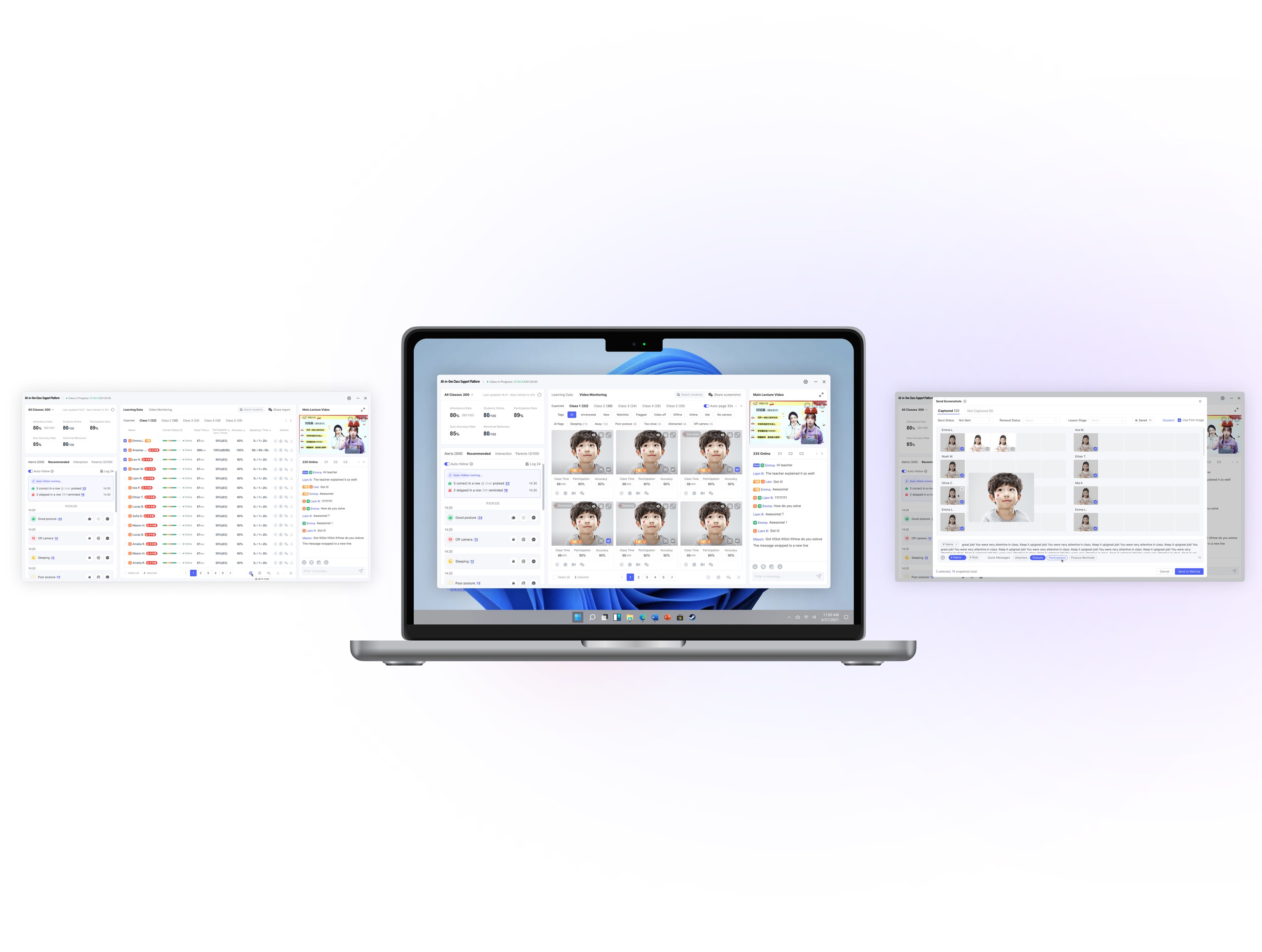
TAL Education Group is a K–12 education company in China. During live classes, tutors supported hundreds of students while switching across 9–10 disconnected tools for attendance, engagement, monitoring, and parent communication.
As the sole product designer, I led the end-to-end design from user research through launch, partnering closely with product, engineering, tutors, and operations stakeholders. I continued iterating on the platform for two years after launch.
I streamlined tutors’ workflows by unifying fragmented tasks into one workspace, automating repetitive operations, and reorganizing information and actions around tutors’ priorities to make classroom operations faster and easier to manage.
The redesigned platform cut core task time — attendance, engagement, parent communication — by about 70%. That time is what doubled tutor capacity: 500 students per tutor instead of 200–300, without diluting personal attention.
6.8 → 8.3 / 10
core tutor workflows
200–300 → 500 students
10 tools. One live classroom.
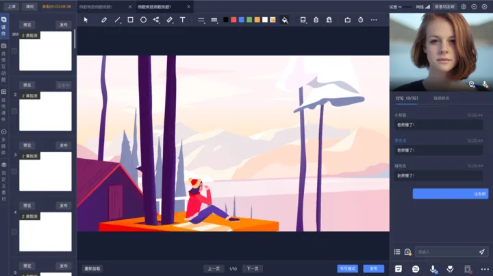
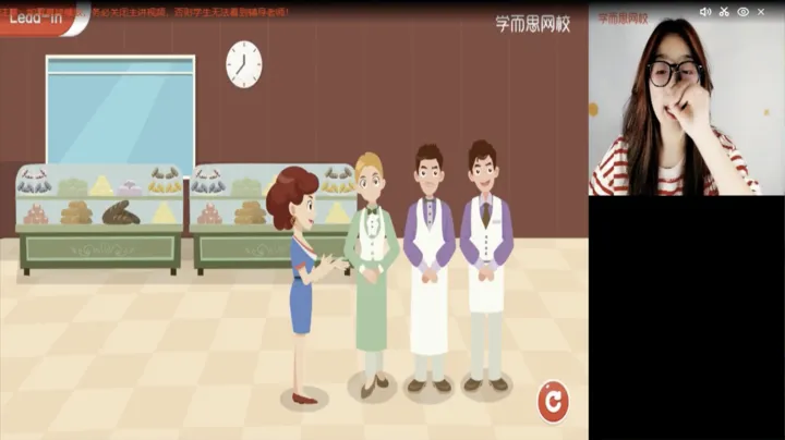
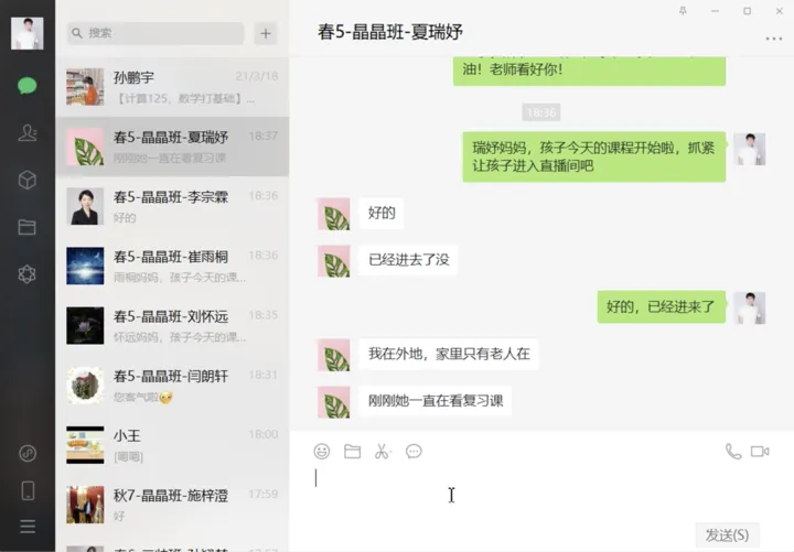
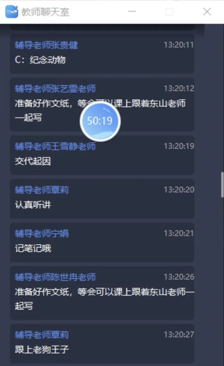
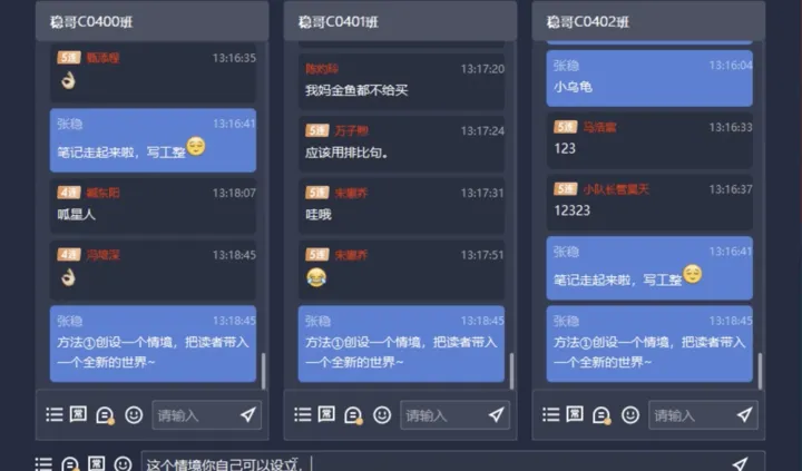
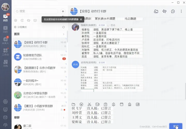
Tutors managed hundreds of students in real time across 9–10 disconnected tools, making everyday classroom tasks slow, repetitive, and difficult to prioritize.
This created three operational challenges:
Teaching & live class 6 tools
Admin & communication 4 tools
Problem to Solve
A tutor had to hold ten tools open at once to run one live class — an unsustainable cognitive load at exactly the wrong moment.
To understand where tutors were losing time and attention during live classes, I combined direct observation and interviews to uncover real workflow problems, then used a survey to validate those patterns at scale.

8 tutors · 12 hours
Capture real-time workflow behaviour and tool switching.
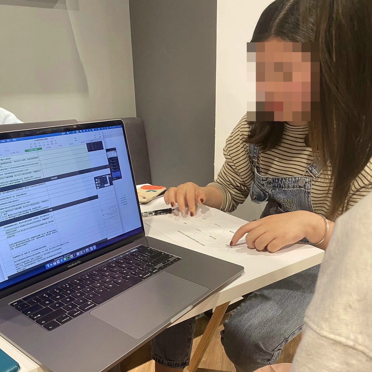
12 tutors
Understand motivations and sources of friction.

N = 347
Validate patterns across the broader tutor population.
Shadowing, interviews, and a large-scale survey helped me understand tutors’ real workflows, uncover recurring pain points, and validate them at scale.
We analysed 347 post-class survey responses to understand how tutors use the interface, which student signals they pay attention to, and which positive and negative behaviours matter most. These findings set the product direction.
Interactive Chat Area, Open Main Lecture Video and Teacher Chat Area were the most frequently used modules.
The most important metrics are attendance rate, total students online and total students attending.
Teachers pay the most attention to students with connectivity or engagement issues.
Teachers most want to encourage active participation and sustained engagement during class.
Teachers are most concerned about absence, off-task behaviour and unfinished work.
Tutors didn’t need more features — they needed one ecosystem. Context switching was crowding out the mentoring that was their actual job.
User InsightsWhat we learned from research
Design ObjectiveHow we addressed these insights
01Product structure
Tutors ran one live class across 10 disconnected tools, so building a picture of the class took longer than acting on it.
Consolidate fragmented tools into one workspace to minimize context switching.
02Workflow
Streamline repetitive operational workflows like attendance and parent feedback.
03Content
Surface the most important student signals and actions so tutors can focus on what needs attention first.
I explored three layout options and evaluated them for information density, task focus, and efficiency. The 1:3:1 layout provided the best overall balance, keeping the live class central while making key information and tools easy to access.
1 : 1
Symmetrical
Equal halves, so nothing leads — the eye keeps switching sides.
1 : 4
Side-heavy
Fits the most data, but pushes the live class off to one margin.
1 : 3 : 1
Centre focus
Roster and detail frame the class — attention stays in the middle.
Based on the 1:3:1 layout, I organized the interface around attention priority—keeping live student performance at the center, frequent actions within easy reach, and supporting information at the edges.
Supporting content
Supporting content
Secondary actions
Primary focus
Secondary actions
Solutions Overview
The platform was redesigned around the tutor’s full workflow—from preparation before class, to real-time classroom support, to post-class parent follow-up.
Pre-Class Attendance Reminder
Tutors had to check absences, verify approved leave, contact parents, record follow-ups, and sync the team across multiple tools before every class.
Bring detection and action into one workflow.
Flagged students and follow-up actions live together, so tutors can identify an attendance issue and respond without switching tools.
Before5 steps, 5 tools
After1 workflow, 1 click
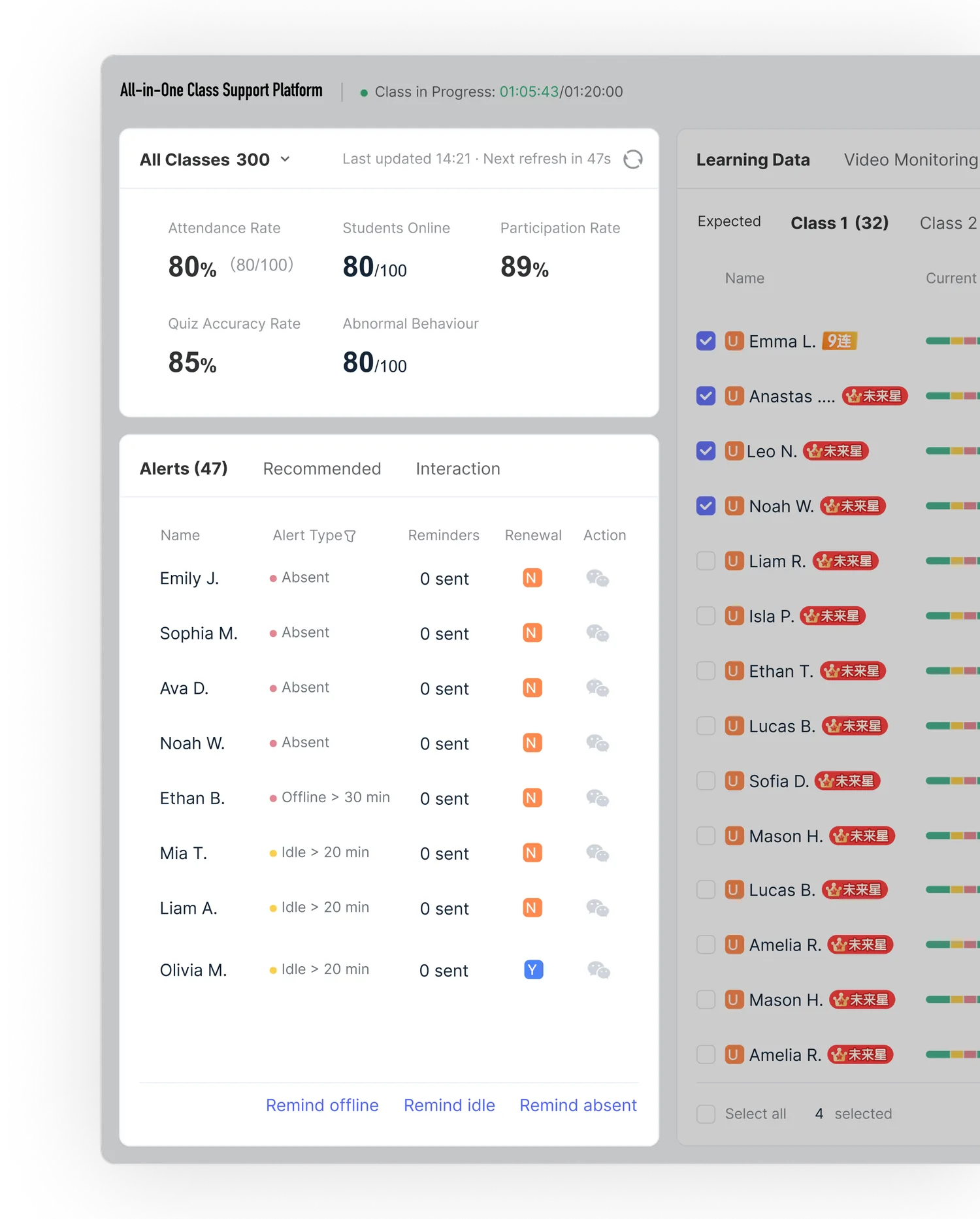
Result
5 steps 1 click
Attendance follow-ups can now be completed in one place without switching tools.
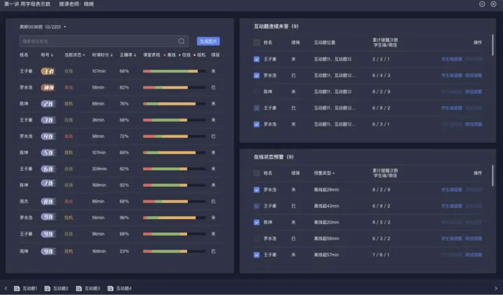
In-Class 01 Engagement Monitoring
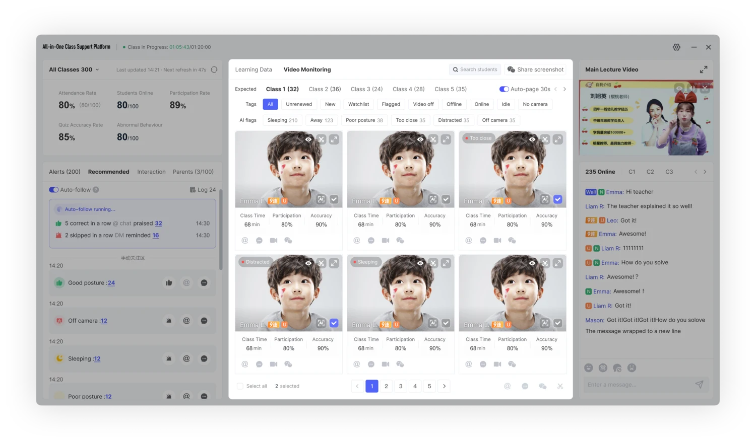
Tutors had to use two separate panels—one for student data and one for live video—so checking a single student meant switching between windows.
Unify student data and live video in one workspace.
Tutors can switch between analytics and live monitoring without losing context.
Before2 panels, split context
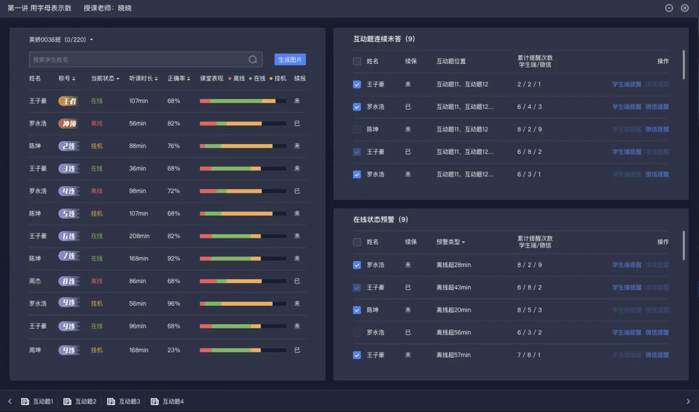
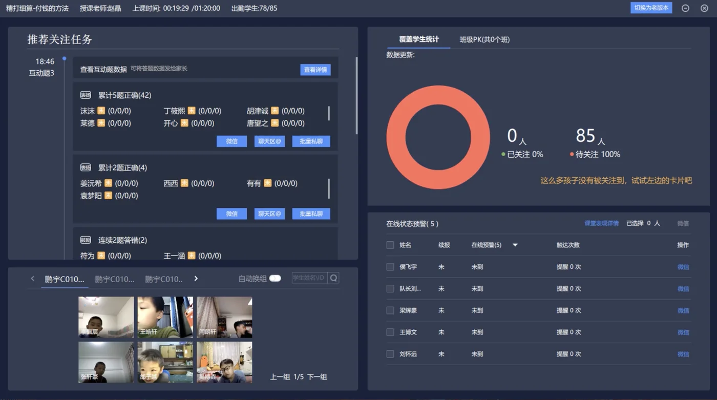
After1 workspace, 2 views
Student Analytics Video Monitoring
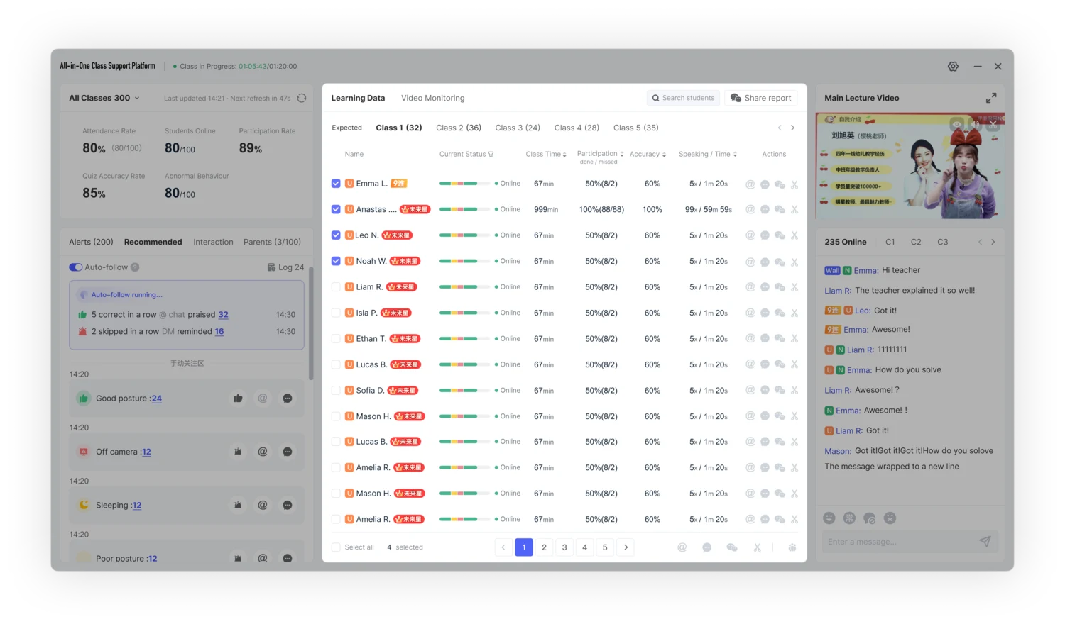
Switch views without losing context
Result
2 panels 1 workspace
Less context switching, clearer focus during live classes.
In-Class 02 Student Interaction
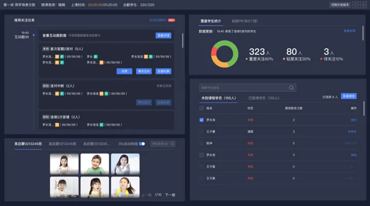
Alerts were visible, but tutors still had to scan student by student to find who needed attention first.
Organize student states by priority and connect each one to the right action.
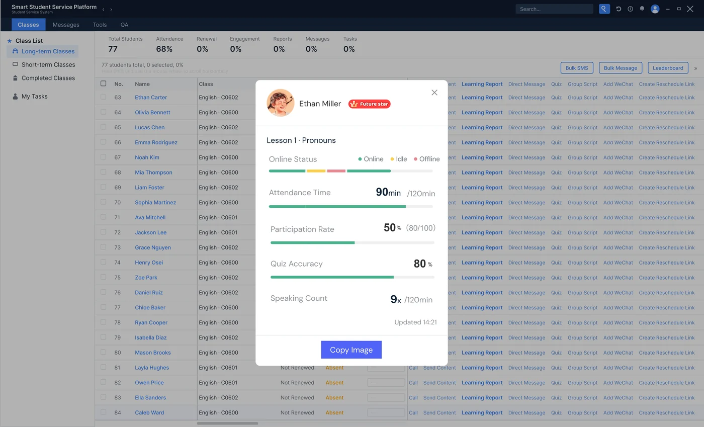
Related signals are grouped by student status, so tutors can quickly choose the right follow-up.
Before2 alert lists, checked by hand
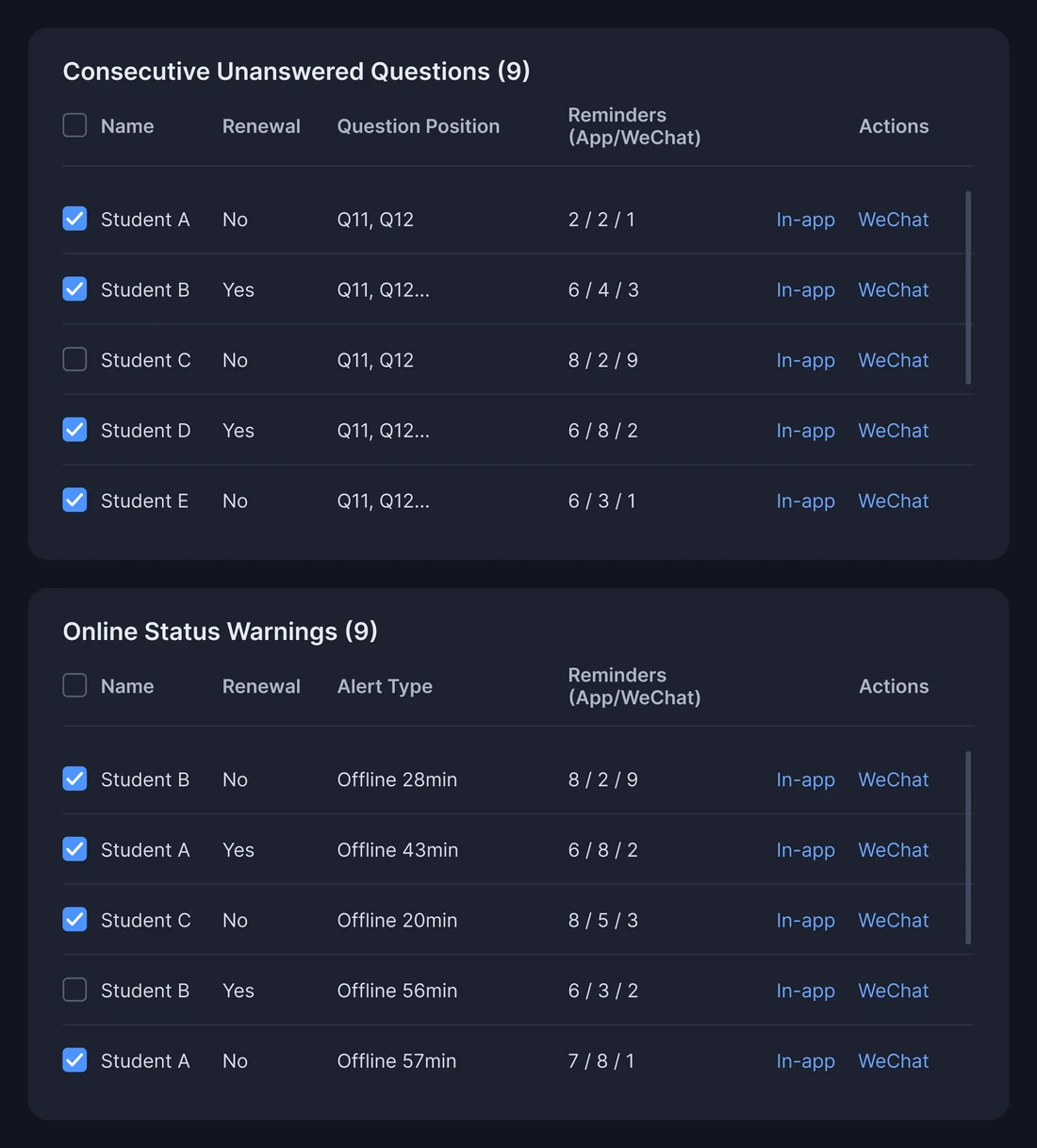
After1 recommended feed
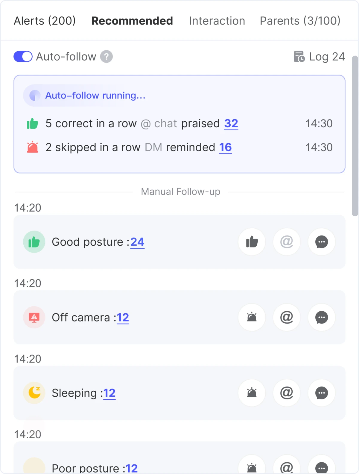
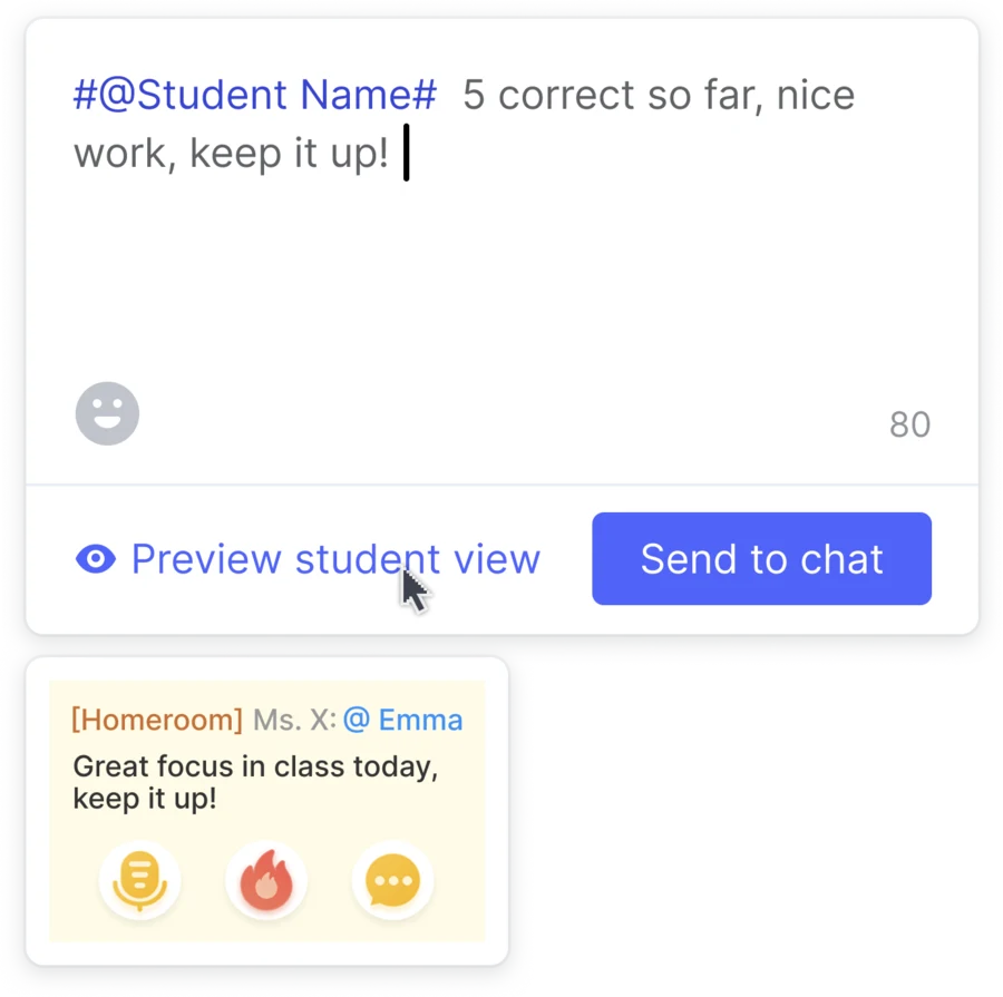
Interaction options
Ways tutors can respond immediately.
Public recognition
Private follow-up
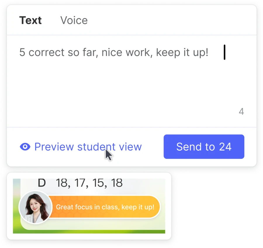
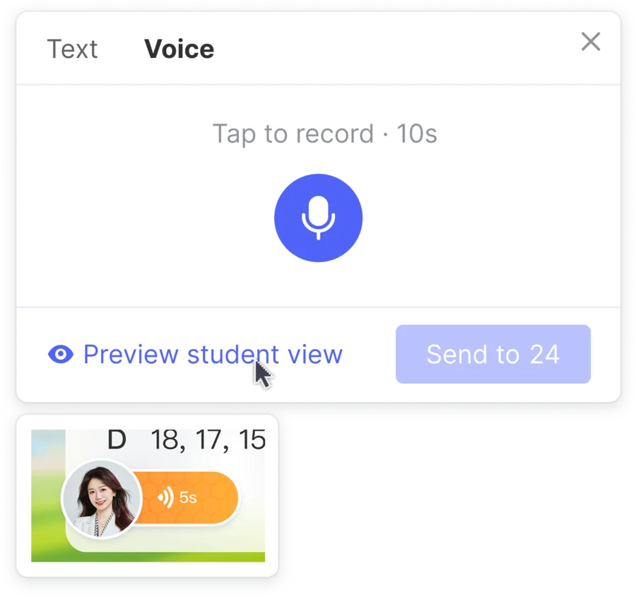
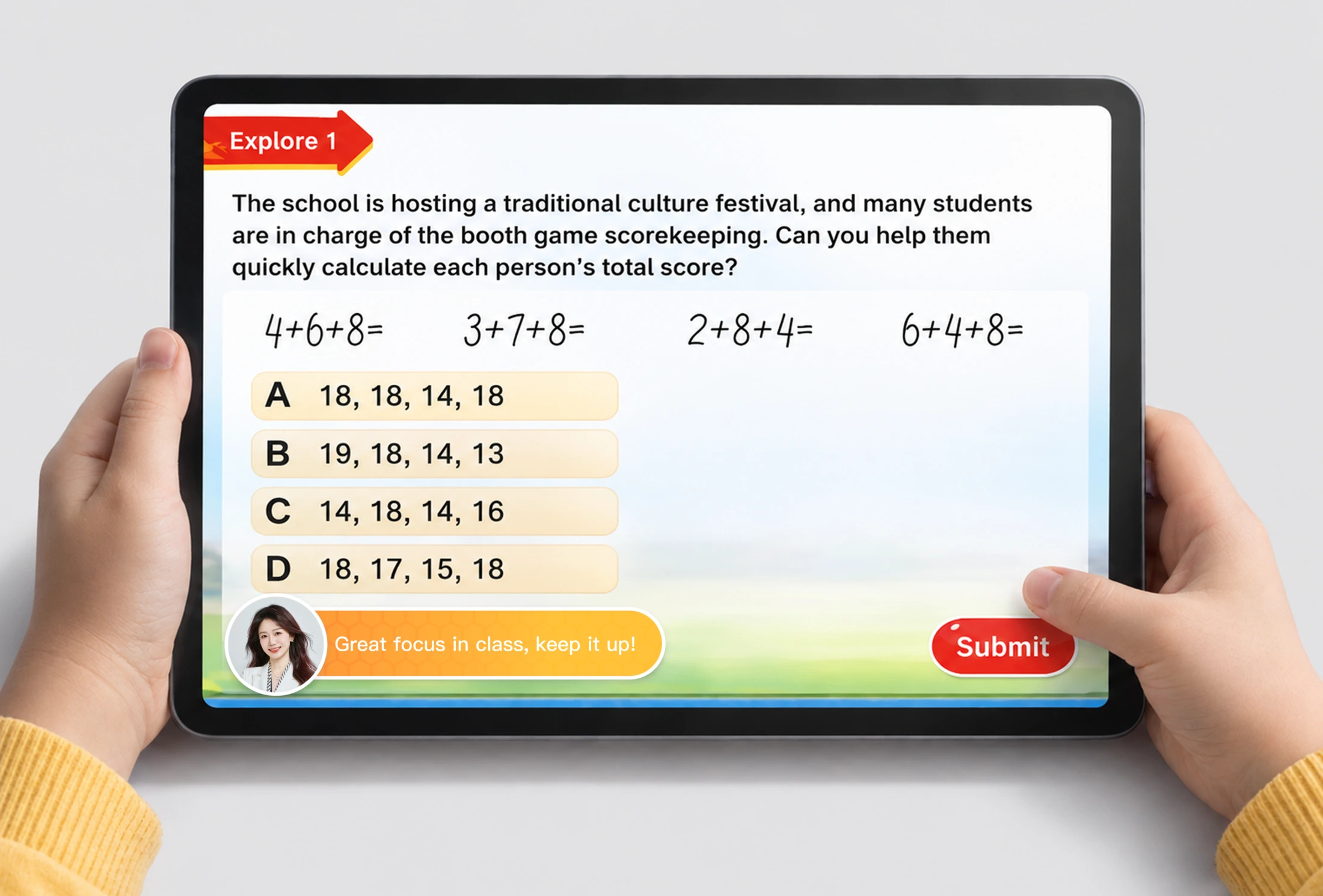
When tutors recognize or follow up with students during class, students feel seen and become more engaged.
Post-launch
Result
Manual scan prioritized support
Priority students surface first, helping tutors respond faster while routine follow-up is automated.
Post-Class Parent Report
Post-class reporting was fragmented and manual, while parents received limited learning context.
Create one automated learning report that connects classroom performance with parent communication.
BeforeManual report, fragmented workflow
AfterOne complete learning report
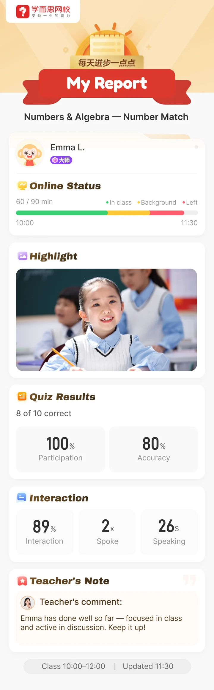
Result
Manual follow-up Automated parent reporting
Parent value
Business & operational value
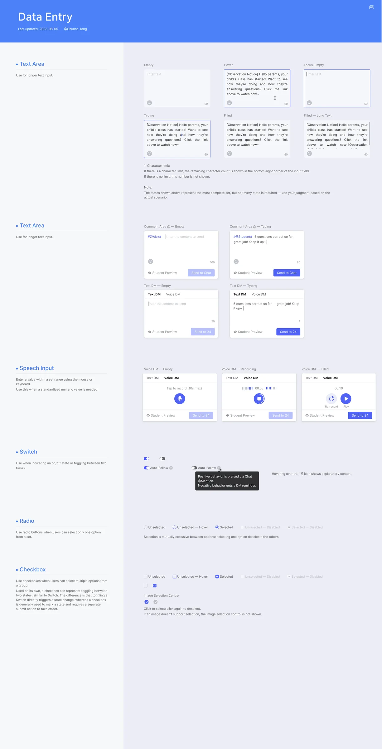
I standardized recurring patterns into reusable components, keeping tutor workflows consistent and scalable.
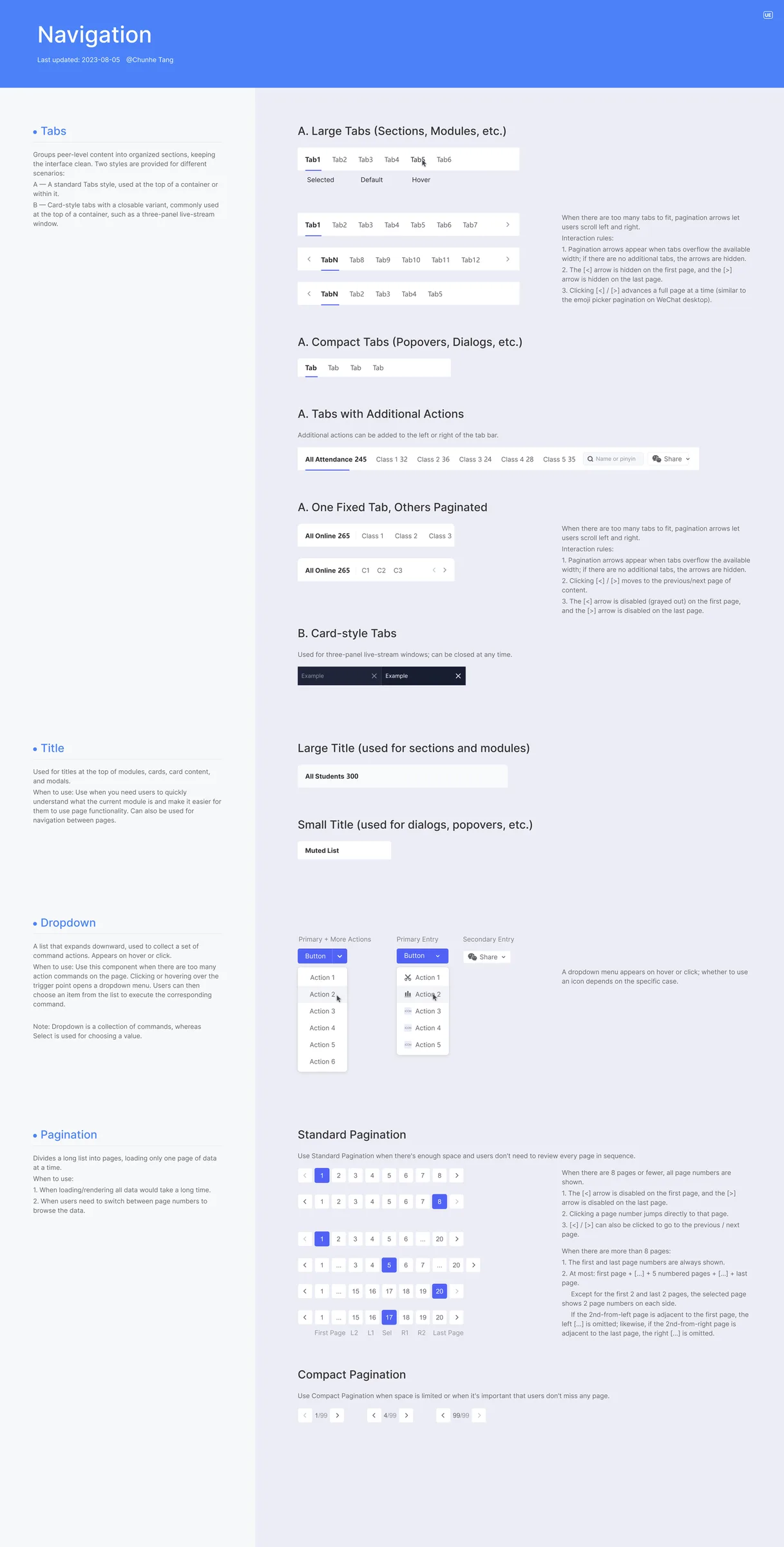
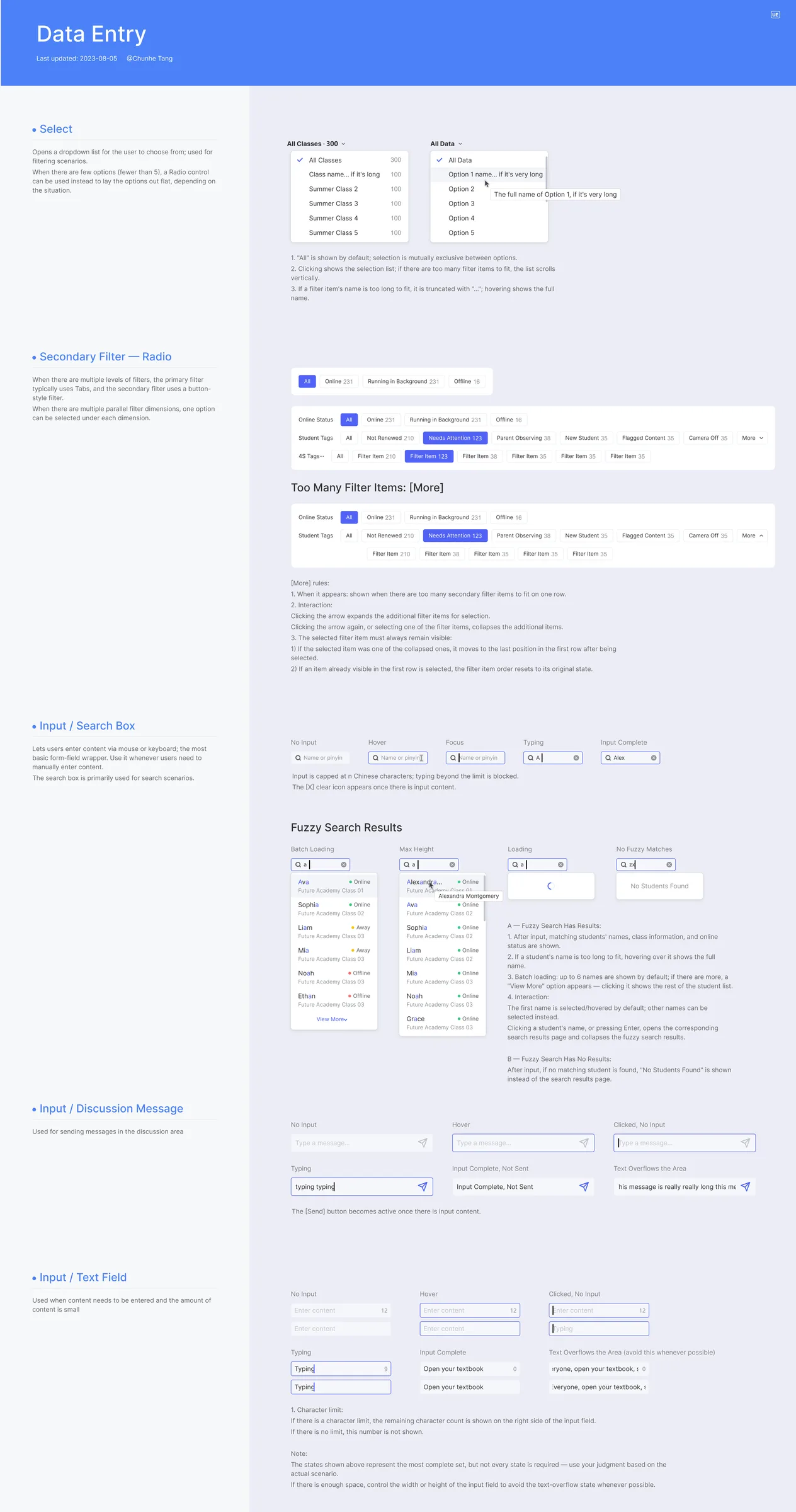
We transformed a fragmented 10-tool workflow into one core workspace, reducing context switching across the full tutor journey—from preparation to live support and parent follow-up.
6.8 → 8.3 / 10
core tutor workflows
200–300 → 500 students
This project reinforced that simplifying complex enterprise workflows is not about removing features—it is about organizing the system around the decisions users need to make.
The next opportunity is to use AI to move from reactive alerts to proactive guidance—predicting which students need attention and recommending personalized support before issues escalate.